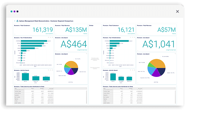
Individuals with specific requirements such as analysts, and operational executives.
Designed to empower the user, allowing them to easily assess a situation, identify an opportunity and instigate a specific course of action.
These dashboards save time and effort by reducing bottlenecks and the need to rely on staff with specialist skills. Democratisation of data is achieved using artificial intelligence that simplifies the application of complex data analysis principles, whilst ensuring accuracy and consistency.
Enhanced analytical decision making with Pareto charts
Pareto is an analytical decision making technique based on the 80/20 rule and is an excellent visual communication tool. Pareto analysis provides you with a clear picture of the top and bottom contributors to your overall success, helping you allocate marketing resources optimally for maximum return on investment.
Apteco Orbit™ includes two types of Pareto analysis - a category level and a banded Pareto - enabling you to answer questions such as: which are the top product categories that equate to 80% of my sales, or who are the top 20% of my spenders?

Display multiple measures with different scales using combo charts
Apteco Orbit combo charts let you display different types of data, in a different way, on the same chart. A combo chart shows the values of one category as a line and another category as a bar, in order to highlight the distinctions in your data with the visual combination of two chart types. This simple visualisation allows the viewer to understand the data at a glance and is a great way to prove or disprove a trend or identify outliers.

Calculated measures allow you to easily calculate marketing outcomes
Calculated measures are available on all dashboard visualisations and enable you to simply add, subtract, multiply or divide data variables and/or full counts of system tables together presenting key marketing metrics as ratios. This functionality means that you can keep track of key stats that will inform whether you are meeting defined KPIs.

Get a clear, concise view of your customer data. Get in touch with the team to learn more about Apteco Orbit dashboards.
Explore other dashboard styles
Analytical style dashboard
In-depth reporting focussing on a specific business function or topic with functionality to explore areas of interest.

Exploratory style dashboard
Advanced data exploration designed by and for advanced users to help evaluate and understand complex data.


Tactical style dashboard
Evaluate and react to results by focussing on a specific business scenario.


