Exploring the benefits and use cases of our new file expressions feature
03 Feb 2022 | by Chris Roe
9 min read
From store location distance to UK house prices and traffic accidents – discover some diverse examples of how our new file expressions functionality helps you to modify data for your analyses without manual user input, how you can include external files within your analysis and even use data from one system in another.
Introduction
In this blog, we will introduce some new expression functionality provided in the Q3 2021 release. This was initially motivated by wanting to improve the flexibility in which marketers can conduct location-based analysis when their location lists are subject to change on a regular basis. However, the functionality which we have introduced is generalised in order that we can use it in other scenarios where changing data no longer requires user input in order to keep the analysis up to date.
We’ll introduce the functionality through a location example and then we’ll show some more general examples.
Store location analysis
Apteco marketing software has long provided a range of expression functions that deal with location information, in both postcode and latitude/longitude format (1). An extremely common use-case is to find customers who live within a given distance of one of many locations of interest (e.g. a store, an airport etc). In many instances we also want to know which of those locations is the nearest one.
In the following example, we have data on customers of our holiday business and the bookings that they have made. We can imagine a scenario where our company flies from 4 UK airports (Heathrow, Gatwick, Birmingham and Manchester). It is then easy to construct an expression which will give us the distance to the closest of these as follows:
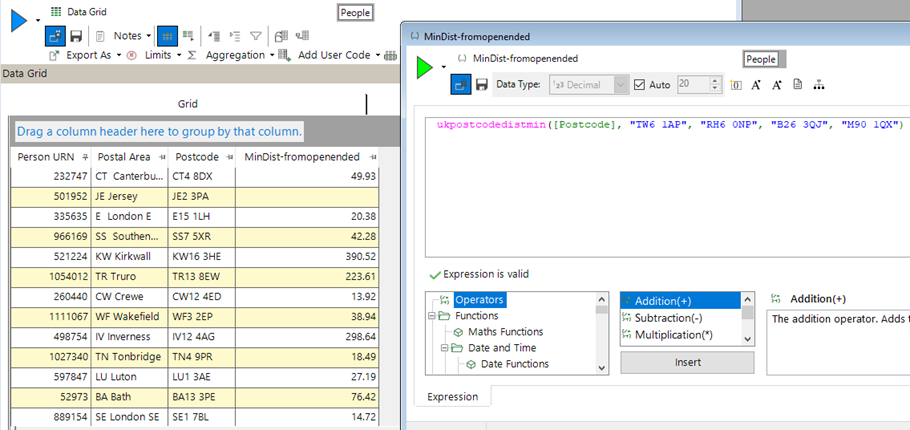
When the expression on the right is added to the grid on the left, a copy of the expression is embedded into that visualisation. The same happens for each time it is used (e.g. in a selection, as a measure in a cube, in an audience in PeopleStage etc).
There are no particular problems with this – until that list of airports changes. We may no longer fly from Birmingham, or introduce Glasgow as a new airport we fly from.
Now all of the copies of this expression in all of the various places it has ended up in, are wrong, and need to be found and edited to give the correct list of locations.
To remove this need for extra work we can have the expression refer to a file, which is then updated by the user on the occasions when the list of points change.
Here is the first view of that expression where the 2nd column in my data file contains the same 4 postcodes as in the first version above.
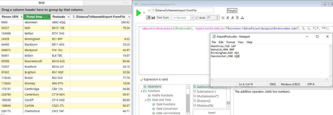
Now, updating the file with the new airport and simply re-running the data grid, we can see that the values in the final column have changed – mainly in this case for customers in Scotland.
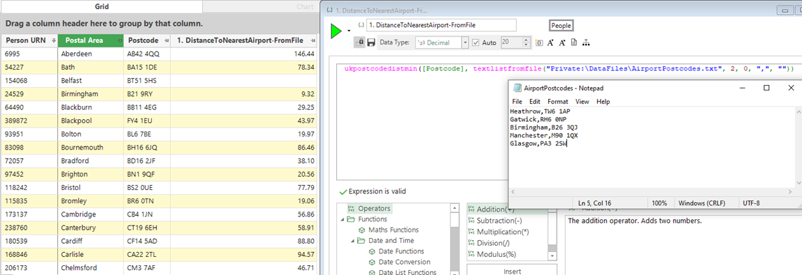
This is a simple example with only 4 locations, but the file could easily contain hundreds of store locations, or thousands of public transport locations etc.
There may be instances in which the analyst wishes to explore the likely impact of adding a new store at a given location. Rather than having to add this to the file (which may be in production use and unable to be edited), the expression above can take any number of file or individual parameters – which means that we could have added the Glasgow postcode as an extra parameter directly in the expression to see the effect on say the mean minimum distance for our highest value customers.
Although the example outlined above uses UK Postcode information, the same technique can be utilised if we had latitude/longitude information. The GeoDist functions work on a worldwide basis using latitude/longitude information to provide the same location-based functionality such as nearest location, minimum distances etc. These functions have also been extended to allow for the use of lists of locations from columns of files.
Using an external data file – inflation indices
The UK Government publishes data on sold house prices in the UK (2). This data contains information on 26 million houses that have been sold between 1995 and the present day. The dataset is limited to location-based information (a number of different fields such as postcode, address, district, county etc), a little bit about it (type, freehold/leasehold, old/new) and sale information (date of sale, sale price).
This dataset is useful in this context to illustrate a nice use-case of using a file in an expression as we have such a large date range. An obvious starting point for analysis is to look at the change in house prices over time.
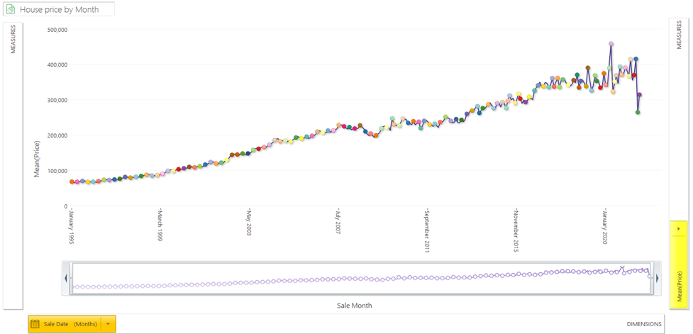
The average price paid has risen significantly over the last 25 years from a low of 65k to nearly 400k. The trend over this period has been largely linear (but with a bit more volatility recently). However, due to inflation we would expect prices to rise naturally anyway, so it would be good to be able to take account of inflation when doing these calculations.
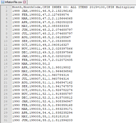
The UK Office of National Statistics (3) publish a whole range of inflation tables (NB – here we have chosen to use CPIH (Consumer Prices Index including owner occupiers’ housing costs). The top of the file is shown below, and I have used a release of this file with data up to August 2021. The third column is an index column where the year 2015 has an average value of 100, and each month is then indexed relative to it. I have added the final column as an extra measure (100 / Column 3) to act as a simple multiplier to be able to express the house prices from a given month in terms of the index month.
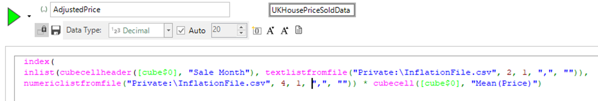
We can then use an expression to lookup the value of the header month, matching on column number 2 in this file, return the multiplier value and then multiply it by the average price in that month to standardise the prices.
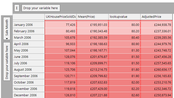
Here is a cube showing the results for months in 2006:
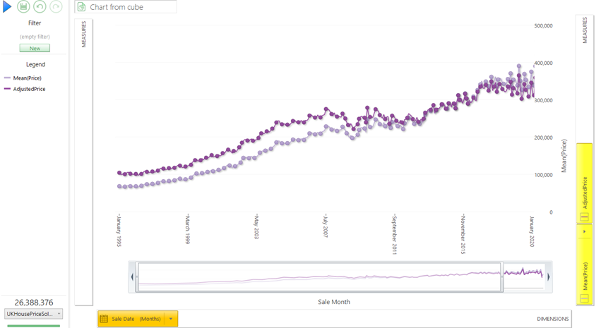
If we visualise this as a chart, then we see the following results for the real price and the adjusted price metrics. I have zoomed in slightly to show the date range from 1995 to the end of 2019 (as there is a lot of price volatility after this point) and I wanted to show the general longitudinal trend of house prices. We can see that the slope of the dark purple line is flatter than the raw prices, but still exhibits an upward trend in house prices.
This technique of using external data files for inflation could also be applied for example to exchange rate data files where we wanted to adjust foreign currency values based on the exchange rate at the time of transaction.
Using data from one system in another
The UK government publishes road safety data (4). We have created a FastStats system from that data which contains information on all fatal and serious traffic accidents and a large number of accidents that are less serious. With the data in that system, we could look for the factors which were more likely to be present in serious accidents.
From that data we can conclude that ‘if a motorbike was in an accident, then it is more likely to be serious than ones containing cars’. However, we could not conclude that motorbikes were more likely to be in accidents in general than cars, since this would require us to know how many motorbikes and cars were on the road’. Similarly, we could not conclude that Fords and Vauxhalls (the two makes which were involved in the most accidents) were more dangerous than say Bentleys or Kawasaki motorbikes. They were involved in a much larger number of accidents but there are obviously more of them on the road. To do this type of analysis we would need to be able to compare the number of accidents involving a vehicle of type X with the number of vehicles of type X that were on the road. For our traffic accident data, we only have the make and model information of the vehicles that were involved up until 2014, so we shall use that year as our example.
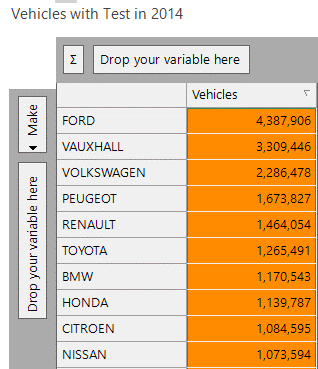
The data in the MOT system (5) has details on all of the MOTs that took place in a given year, together with some information about each of the vehicles. From this we can get a good idea of the number of cars of each make that are on the road in a given year, with the results easily obtainable in a cube as shown below.
We can then output this cube as a tab-delimited file using the Output wizard, and copy this file so that it is accessible to the accident system.
Fortunately, the variable values of the ‘Make’ in the MOT system and the ‘Vehicle Make’ in the accident system are the same so we can look up the value from the data file above in the traffic accident system.
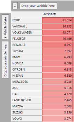
Below is a cube showing vehicles which had accidents in 2014 broken down by car make.
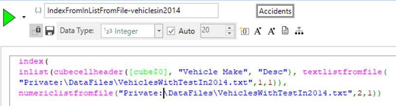
We can use the expression shown below to return the number of vehicles of that type that had an MOT as a statistic on the cube. The CubeCellHeader expression looks up the vehicle make description on the cube dimension, finds it in the file and then returns the corresponding vehicle count column:
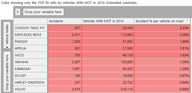
Now, we can use a simple ratio measure, and sort them to find the highest percentage of accidents per vehicle on the road. We have looked here just at the top 50 car makes by volume of accidents (this excludes some outlier categories where there were few MOT tests as many vehicles of that type were exempt):
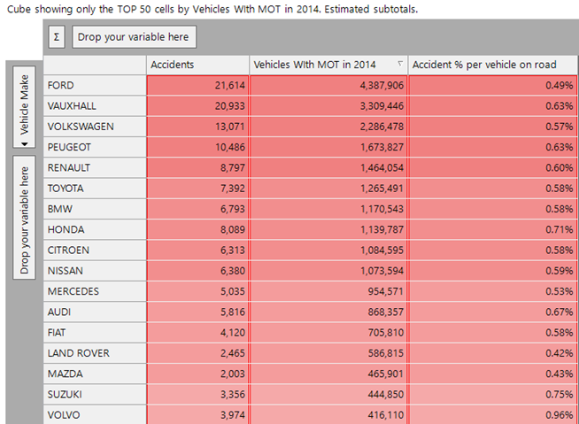
There isn’t too much variation here, the top 3 by the final metric in this list are Honda, Suzuki and Volvo. The first two have motorbikes and the last has a number of lorries.
If we sort the cube on the final measure we get a more informative insight when looking at the top 10 values in the final column:
Six of these are predominantly motorbike manufacturers. Of the remaining, Iveco are mainly lorries, Mercedes Benz (which has a mixture of cars and lorries). We discussed Volvo in the previous paragraph. Finally, London taxis comes top of the list as having the highest accidents to vehicles ratio.
Whilst the focus of this example is how we can use data from one system in analysis on another system, the above insights are not the end of the story.
Further exploration in the MOT system shows that London taxis, and many of the vehicle makes which are entirely (or largely) trucks, have a much higher average mileage than other makes. This is intuitive as these vehicles will be on the road much more and be driven much further. On average, motorbike makes are ridden less than car makes and so an alternative approach could be to look at accidents per miles driven. We could use the technique above to incorporate that data into our analysis.
Conclusion
The development of file-based expressions has given the user extra flexibility and power in defining expressions which can have their parameters change, whilst the text of the expression remains unchanged and therefore is safer to use in scenarios where it is embedded into production analytics and campaigning.
Notes and References
1) We have covered Geographic Expressions in a previous blog (see Geographic Expressions in FastStats | Apteco)
2) This website has UK sold house price data - https://www.gov.uk/government/statistical-data-sets/price-paid-data-downloads
3) The UK Office of National Statistics website has lots of inflation table data at - Inflation and price indices - Office for National Statistics (ons.gov.uk)
4) The UK Department of Transport publishes road safety data at - Road Safety Data - data.gov.uk.
5) The MOT system contains all the data from MOT tests carried out in the UK from 2005-2019. For each test, we know the vehicle and some details about it, the date and result of the test and any reasons for failure. For a given year (say 2014) we know all the vehicles that had an MOT test in that year and this a good approximation of the number of vehicles on the road in that year (as only a small number will be exempt).