The Apteco Datathon: 4. The property market in Melbourne
12 Dec 2018 | by Chris Roe
Using FastStats, we analyse key data to see what has the greatest impact on property prices in Melbourne.
Introduction
In this blog we’ll explore factors affecting property prices in Melbourne. We’ll be using a small dataset of nearly 35,000 records taken from properties sold in Melbourne over a two year period up to March 2018.
We’ll show some interesting exploratory analysis of property price factors and we’ll use the mapping and expression tools to show some fascinating analysis. We’ll also finish up by using the predictive modelling functionality to explore what makes a property expensive.
The data
We’ve downloaded this dataset from Kaggle (1) comprising properties sold in Melbourne between January 2016 and March 2018. For each record, we have information about how much the property sold for, together with a number of factors of information about the property. These include geographical indicators such as suburb, latitude and longitude, property specific information such as land size, building size, number of rooms, and sale specific information such as the agent and the date of the sale.
There are other factors which may affect the property prices that are not included within the given data, such as:
- Distance to public transport (but we’ve added these!) (2)
- Weather data on the day of each sale (3) (but we’ve added these!)(4)
- Location and quality of nearest schools (we’ve not added these!)
And there are probably other influences as well that we haven’t thought of.
The resulting FastStats system is a very simple design with a small number of variables, one main table of property data, and the weather data linked as a lookup table.
Some Exploratory Analysis
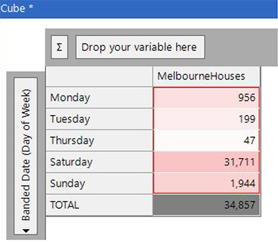
A significant number of Melbourne properties are sold by auction and a quick breakdown by day of week backs up that assertion of day of sale.
More interesting is to look for trends and seasonality patterns within the sale dates. The chart below shows the spring months (Sep-Nov) having a higher number of sales. The lowest months are January and December (not too unexpected as they’re around Christmas time). However, the low figure in April – less than half of the months either side of it - seems somewhat questionable at first glance. It may be low because of Easter holidays, it may be low because of errors within the source data.
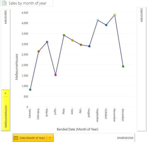
We have a limited amount of longitudinal data within our set so we can’t make too much of these charts. Furthermore as we didn’t collect the data we can’t easily verify whether the dataset contains a complete set of property price sales.
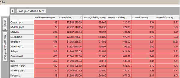
The following cube is an example of a quick piece of analytical work that we can undertake to look at differences between particular suburbs. In the screenshot below I’ve ordered suburbs by average sale price and it shows the most expensive suburbs (5). There are some differences between the suburbs that are present in this list:
- Some have a small building area and land size but are close to the city centre (e.g. Middle Park and Albert Park)
- Some have a lot of land (e.g. Balwyn North)
- Some are bigger or have a larger number of rooms (e.g. Canterbury, Deepdene or Kooyong).
This exploratory analysis enables us to understand more about the data set and will help us when we come to undertake more advanced analytics on the data.
Calculating distance from public transport
Proximity to public transport may be an important factor in influencing property prices, so this would be good to add to the data provided. There are three main forms of public transport within Melbourne – trains, trams, and buses (6). In this analysis we’ve used just the train and tram stop information.
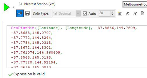
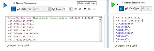
Once we have this information we can then formulate expressions to work out the distance to the nearest stop/station and also the name of the nearest public transport stop/station. To do this we use the GeoDistMin() and GeoNearest() expression functions.
These functions take a single latitude/longitude (latlong) pair and work out the distance to a set of other latlong pairs and return the smallest of those values. The screenshot below shows the start of the expression which contains over 200 location pairs to calculate the distance to.
The GeoNearest() function operates in the same manner, except that it returns the index of the latlong pair within the list. This can be wrapped within the Index() function to then return the name of the closest station/stop. The right-hand side of the screenshot below shows the start of the section showing the name of the railway station to return.
Other expression functions within the Location family can be used to find the Nth nearest if required. In this example we’ve used over 200 train station locations and over 1,000 tram stop locations, but the same logic would have applied if we had six or 60,000 location points of interest. In a marketing context, this type of analysis can be invaluable to finding customers located within a particular distance of any store. We’ve used this approach previously to find distance to nearest airport, nearest cinema and nearest post office within the whole of the UK.
Visualising using maps
The mapping capabilities of FastStats enable insights from analysis that have a geographical basis to be explored, visualised, and communicated.
Thematic maps
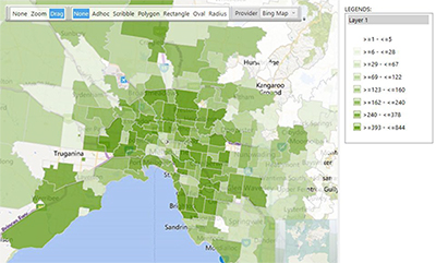
The first two maps in this section are thematic maps showing the distribution of numbers of sold properties and the average property price broken down by postcode area within Melbourne. The first shows that more properties are sold in and around the city centre area and near suburbs, with the number of sales in outer suburbs dropping off reasonably quickly.
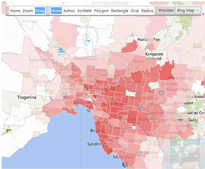
The second map below shows the average sale price for the properties within each postcode, and demonstrates a definite shift towards the eastern and southern suburbs for the more expensive properties. This pattern correlates nicely with external maps produced by Australian media sources comparing suburb property prices across Melbourne (7).
Reference maps
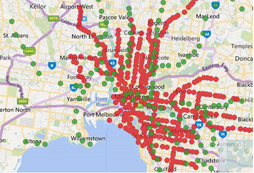
A reference map can be used to plot particular points of interest that are not within the FastStats data set. A common use case for this type of map would be to overlay retail store information on the top of a shaded map showing distribution of customers.
In our standard holidays dataset this might represent the location of airports, ferry ports or our travel agent locations. In the example screenshot below we’ve taken the location points we used in our earlier expressions to plot all the train stations (green) and tram stop locations (red).
Reference map layers are defined by dragging in a delimited file representing the points of interest. Hovering over those points of interest will give a tooltip with the fields that were present in the data file used for the points (so you can provide extra information about the particular location as a field within the reference file to be shown when you hover over it).
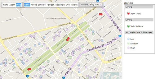
Plot maps
A plot map can be used to accurately locate a set of records onto a map at their location and optionally colour them based on a particular attribute of the data. In the example below I’ve built on the multi-layer reference map above and selected all the properties sold in the suburb of Port Melbourne. Furthermore, I’ve then coloured the plot points in this layer based upon whether they fit into my definition of low/medium and high priced properties. I also added a number of other data fields to the plot map so that hovering over a point would show relevant information about that property (8).
Is this an expensive property?
In this section we’ll use some of the predictive modelling capabilities built into FastStats to try to explain what makes a property expensive. I’m going to use the top 10% percent of all property price sales (3,486) as my analysis set, and the whole set of properties (34,857) as my base set. We’ll begin by looking at a set of variables that we have available and see how accurate they are as predictors of whether a property is expensive or not.
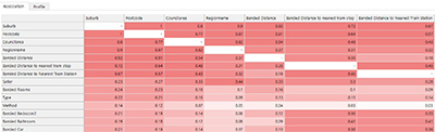
In our dataset we’ve started with 22 possible predictors and my first step is to consider which variables that I might want to use within my model. One useful tool is the association matrix provided by the Modelling Environment tool, which allows us to see the correlations between our predictive variables. This information, in conjunction with my domain knowledge, allows me to select variables that I think will be important. It also allows me to remove variables that definitely aren’t going to be relevant or that are highly correlated with other variables.
The screenshot below shows a section of this matrix in which I can see some variables with very high correlations with Suburb. I’ve decided to remove many of these highly correlated variables (Postcode, Council Area, Regionname, Banded Distance) as they’re giving roughly the same information as the Suburb does. I’ve decided to keep the distances to public transport as these may be variable within a suburb and may have an effect on prices (e.g. to test whether, within a given suburb, equivalent properties that are closer to public transport may be more expensive).
Using this information, I have then created a profile to see which variables are most highly predictive of whether a property is in the top 10% of all property sales prices. The variable level view below is sorted in order of predictive power and shows a couple of immediate points of interest:
- Suburb is the most important predictive variable that determines whether a property is expensive.
- Weather on the date of sale has no impact on expensive property prices.
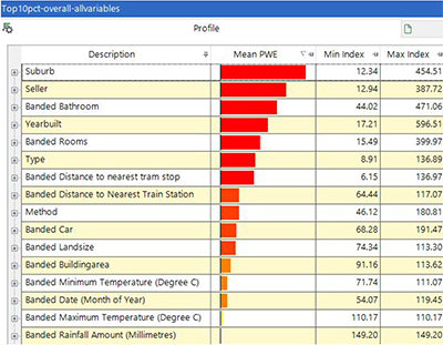
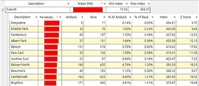
Within each variable we can expand to see the particular categories that are important. In the screenshot below we can see the suburbs that are most highly over-represented within the expensive property segment.
We could repeat the process by looking into the other variables and seeing which values correspond to expensive property prices. This process also gives me some understanding of where I can improve my model categories by changing the bandings (for instance changing the Yearbuilt bandings into decades). In reality I would spend some time exploring these relationships to improve the quality of my model and removing variables of low predictive quality so that my final model ended up with a small set of variables with good predictive power.
This model can then be used to predict whether a property is going to fall into the expensive categories before its sale based upon the other factors that are known in advance of the property being sold.
Conclusion
The size of the dataset used in this post is very small in comparison to many FastStats systems, but nevertheless it has enabled us to be able to find interesting insights about the Melbourne housing market. It would be interesting to add data about property price sales in other Australian cities to compare the trends across time and across different parts of Australia.
References
- Melbourne sold property price dataset - https://www.kaggle.com/anthonypino/melbourne-housing-market/home
- Public transport location data in terms of latitude and longitude points are not directly available (but they are in the UK for instance). We’ve written an R script to capture location data for different types of public transport stops in a few Australian cities. For this analysis we’ve used the locations of train stations and tram stops in Melbourne.
- To those outside Australia this might seem a completely unimportant variable for analysis of property prices. However, in Melbourne a significant number of properties are sold at auction so maybe the weather does play a part in the number of people who attend the auction and ultimately have an impact on the sold property price.
- There is more than one way to get Australian weather data, but for this analysis I’ve used the R ‘bomrang’ package to extract the weather information for the day of the sale and add as a lookup table in Designer. We’ve added the temperature, wind and rainfall variables to our dataset.
- We have made no distinction here between different types of properties, such as houses and units within this analysis. Furthermore, in this analysis I have used a statistic of Mean(Price) whereas often in Australian property price analysis a Median statistic is used.
- There are also some ferry services, but these are much more limited than when compared to Sydney for example.
- https://www.theage.com.au/national/victoria/melbourne-s-richest-and-poorest-suburbs-how-does-your-area-compare-20180327-p4z6hi.html
- I’ve not shown this functionality in the screenshot as this would provide information identifying that particular private property in a public domain blog post.